Issues List
Unique pages
Page: https://fabulous-gecko-88393f.netlify.app/
Critical
Mobile:
-
Dennis Layout issue: user can scroll left right a bit, video attached bellow
-
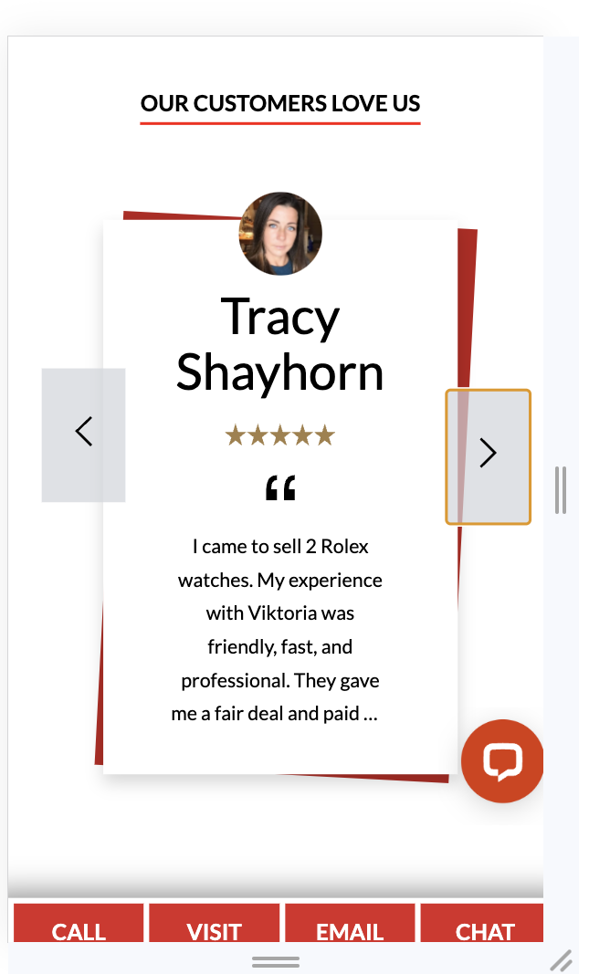
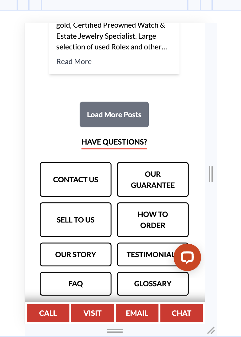
# Dennis 2. Testimonials navigation buttons don't align
-
Dennis On mobile livechat icon overlaps "call, visit, email" cta buttons
Dennis: This observation is inacurate, please check on actual mobile view (not resized desktop view)
-
Dennis Testimonials navigation buttons don't align
-
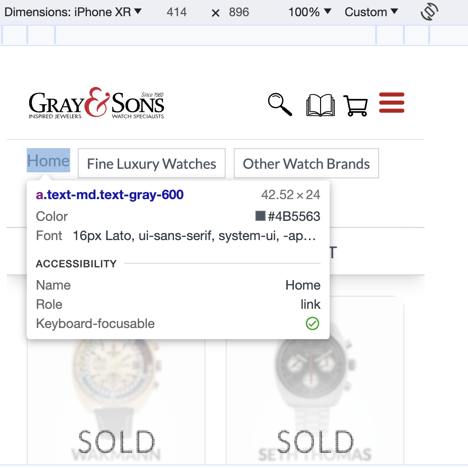
Dennis Update headings to make the same height(72px) on desktop
Warnings
Mobile:
- Dennis Truncated text doesn't align
Recommendations
Desktop:
- Greg Update sliders to move one step forward and back on click instead changing all 3 cards, it looks more smooth and more pleasing to the eye.
Greg: I've implemented the other type of slider but I'm not sure if it's better. Isn't it too much clicking to go to the last item? Or even to the 6th? We will ask people what they prefer.
-
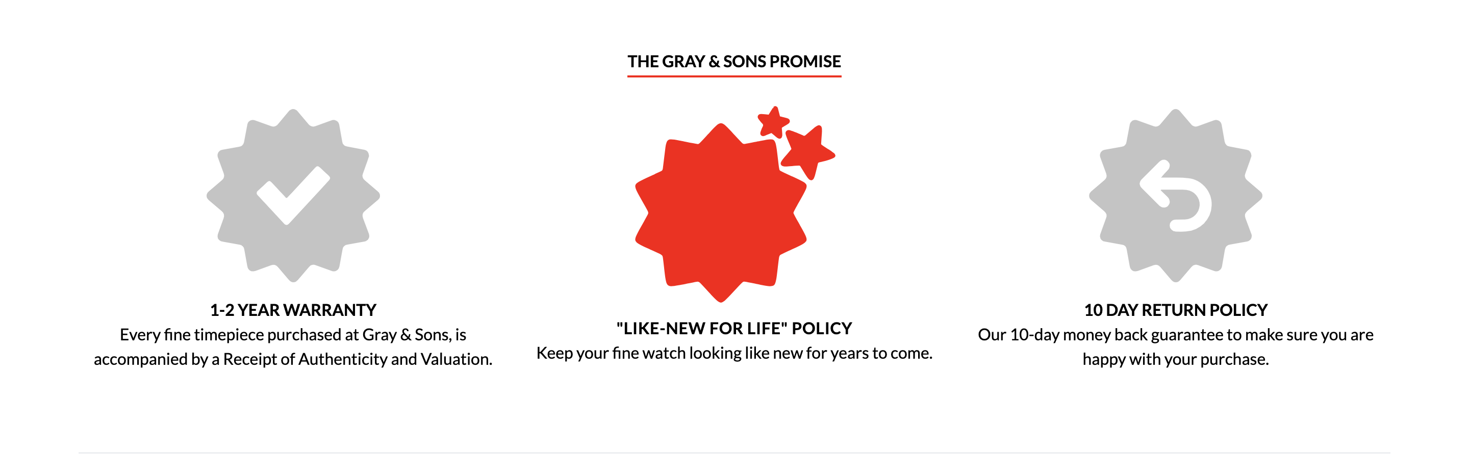
Dennis "The THE GRAY & SONS PROMISE" view elements look interactive because of hover effect but it's not a buttons or links what might confusing user. Solutions: update elements with links or removed hover effect
-
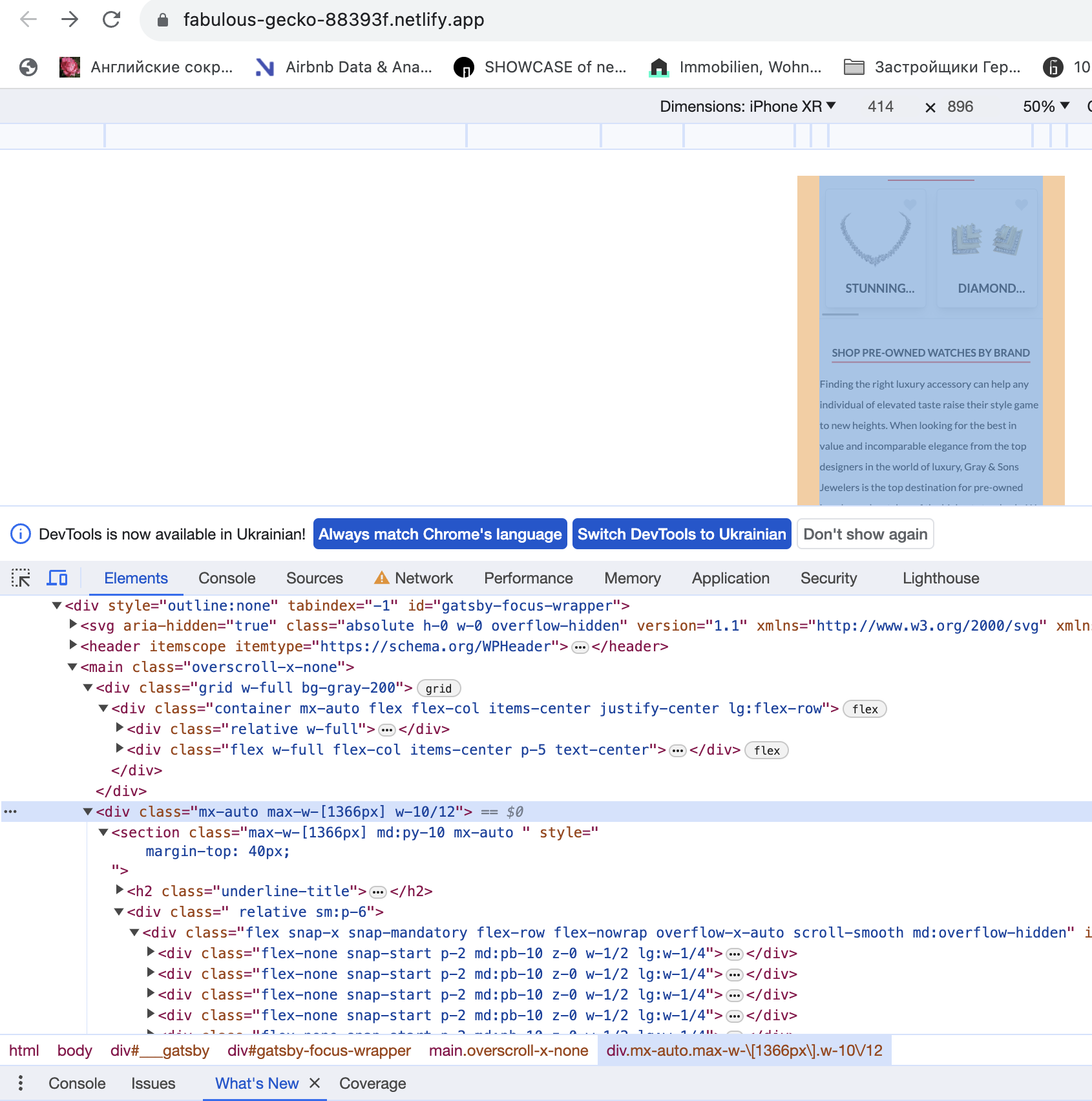
Dennis Update layout paggind to 20px instead 40px
Dennis: We do not understand what this refers to. Please clarify.
Sam: Sorry Dennis, didn't see you have some notes for me. I meant here(homepage, mobile devices) we use hardcoded layout size, here related className: mx-auto max-w-[1366px] w-10/12. All other pages have full width container and left right padding 20px. So it might be better to have the same layout for all pages. Please let me know if that makes sense. Thanks!
Dennis: I am seeing exactly this " className="mx-auto max-w-[1366px] w-10/12 "
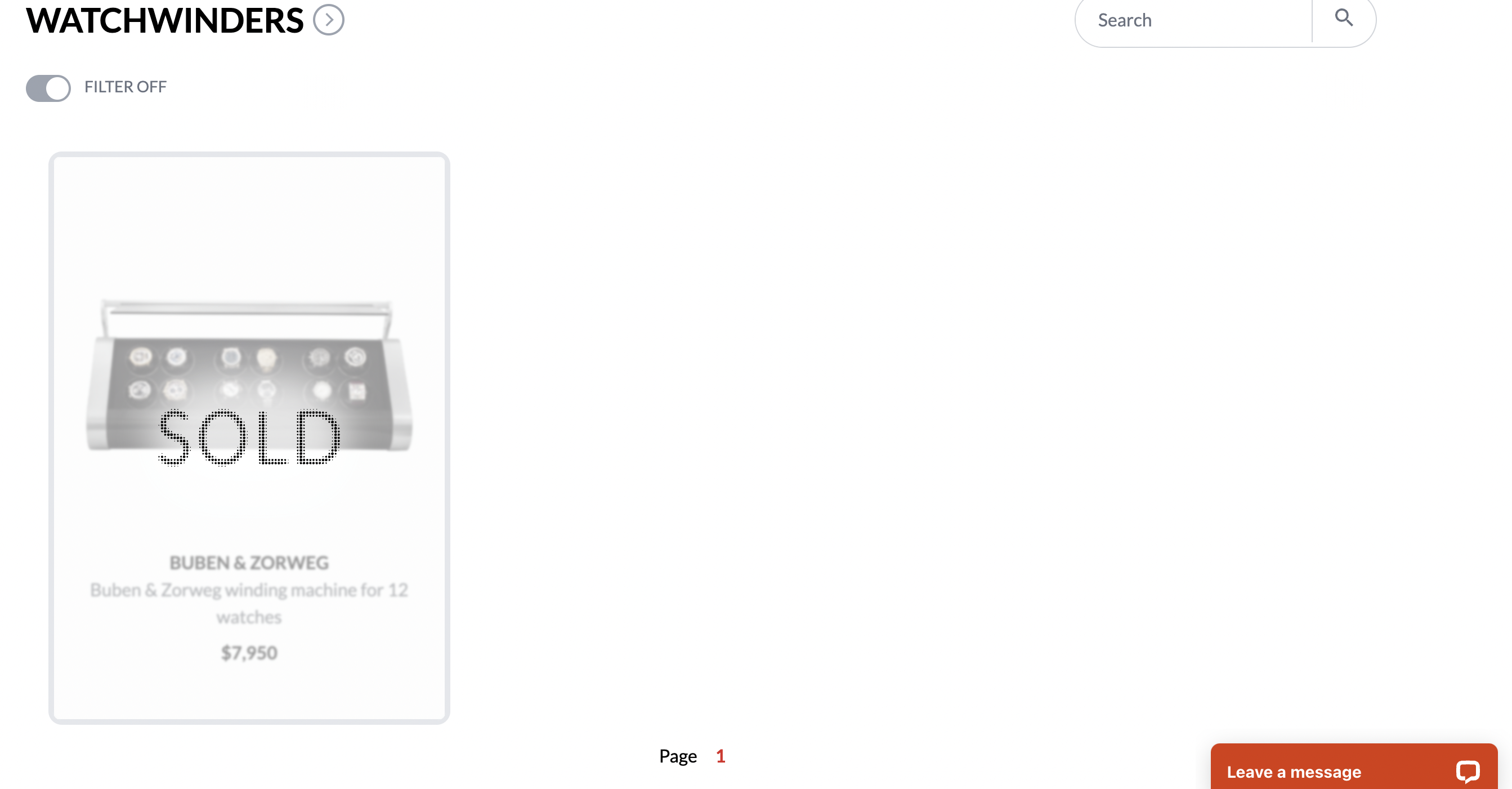
Page: https://fabulous-gecko-88393f.netlify.app/all-watch-brands/
Critical
Mobile
-
Dennis Breadcrumb brokes layout when choosing more categories
-
Dennis Header looks weird on pages different from first
Warnings
Desktop:
- Dennis Add space between breadcrumb navigation and header
Mobile
-
Dennis Add space between cards listing and pagination

-
Dennis Home link is not centered by vertical
Recommendations
Mobile
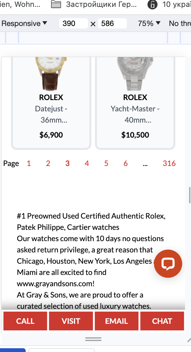
- Greg Reduce pagination to 1 2 3 ... Last one
Greg: I've changed this to first and last page, current page and +/- surrounding that depends on screen size: xtra-small - 1, small - 2, medium-up - 3
Page: https://fabulous-gecko-88393f.netlify.app/catalog-request/
Warnings
- Dennis In have questions view address is not centered, mobile and desktop

Page: https://fabulous-gecko-88393f.netlify.app/checkout-thank-you/
No issues found
Page: https://fabulous-gecko-88393f.netlify.app/checkout/
Warnings
-
Greg I was trying checkout for a mupltiple products and was getting some errors
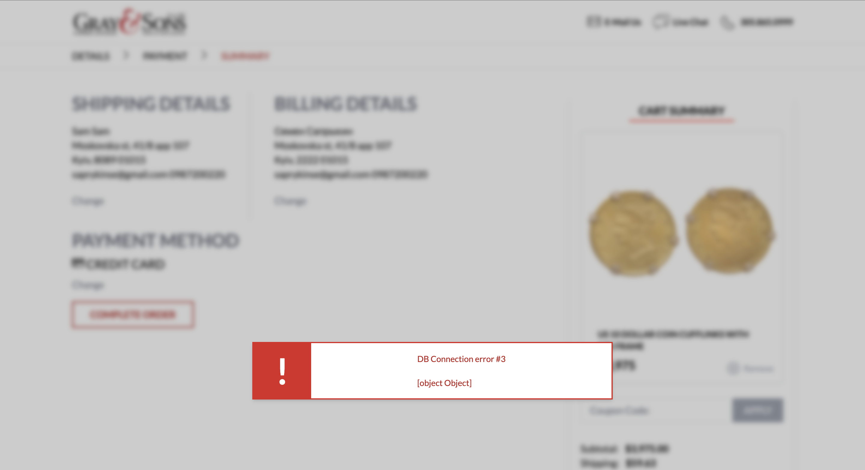
Sam: Greg, I've checked it once againg and seems like still doesn't work on my end for some reason. Any chance it's because of location or something still need to be fixed?
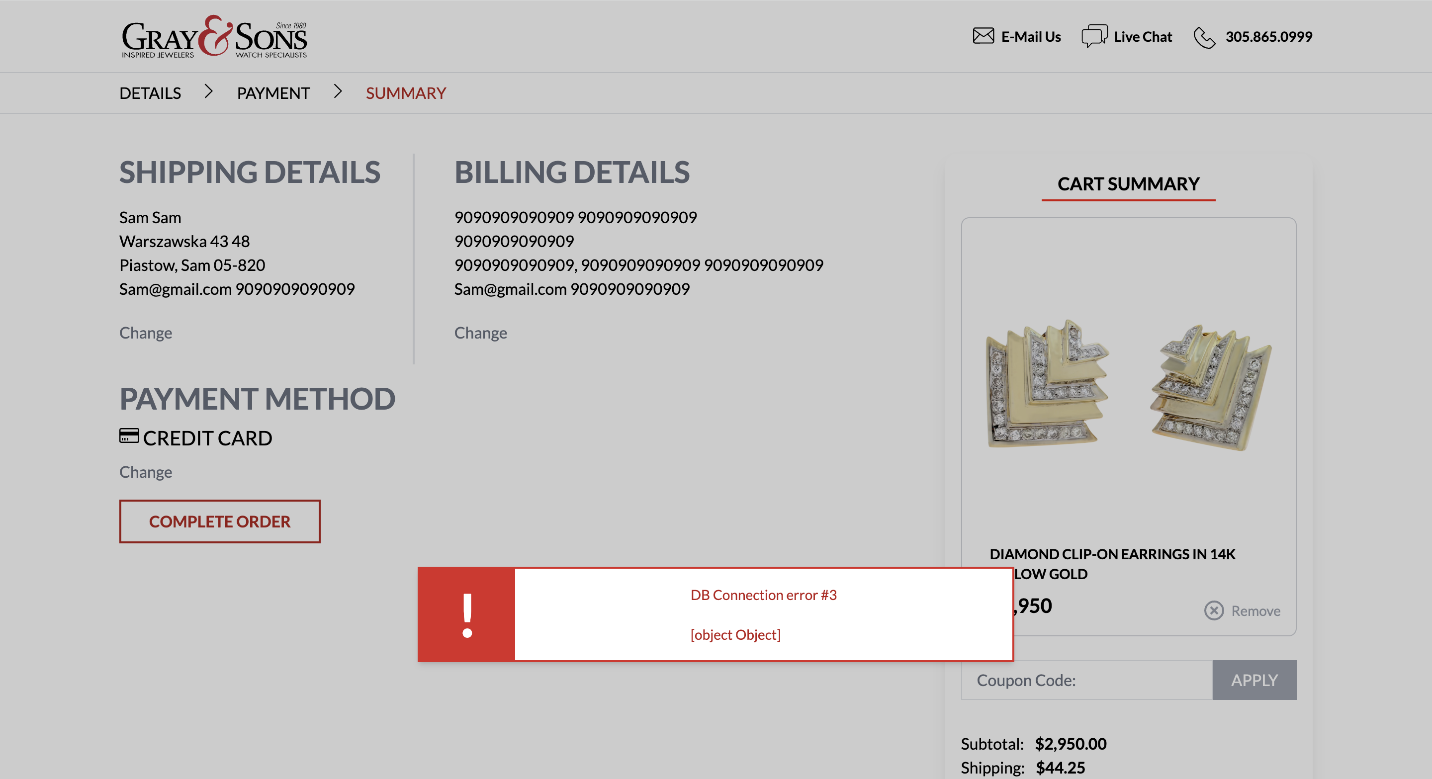
-
Greg Live chat button doesn't work
Page: https://fabulous-gecko-88393f.netlify.app/contact-info-submitted-thank-you/
Warnings
- Dennis Address text is not centered
Page: https://fabulous-gecko-88393f.netlify.app/contact/
Critical
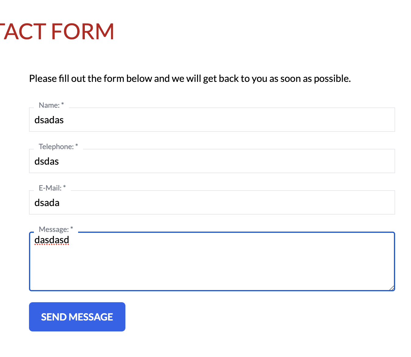
- Greg Email and mobile inputs validation is missing
Mobile
- Dennis Some Images border looks odd and ANTONELLA DIAZ images looks smaller then other
Warnings
- Dennis Address text is not centered
Recommendations
- Greg Add invisible recaptcha to protect form from Spam https://developers.google.com/recaptcha/docs/invisible?hl=en
Greg: Based on our experience on SellUsYourJewlery.com, we don't need to add recaptcha to the contact form. We've never had spam submissions on that form as the submission requires a JavaScript execution (onSubmit handler), so it basically works as an invisible captcha. If something changes, I'll keep this recommendation in the backlog
Page: https://fabulous-gecko-88393f.netlify.app/email-signups/
Critical
-
Greg Form submission doesn't work https://www.loom.com/share/8e5272b2d32944a2a0391ad134d13129?sid=58a1595e-b1a8-4fe7-b059-cdfd4bfbedd5
-
Greg Email and mobile inputs validation is missing
Greg: mobile phone number is not mandatory as the purpose of this form is to capture and sign up them for email blasts.
Warnings
- Dennis Address text is not centered
Recommendations
- Dennis Reduce Title font size on mobile

Page: https://fabulous-gecko-88393f.netlify.app/ez-ship-box-request-form/
Critical
- Greg Email and mobile inputs validation is missing
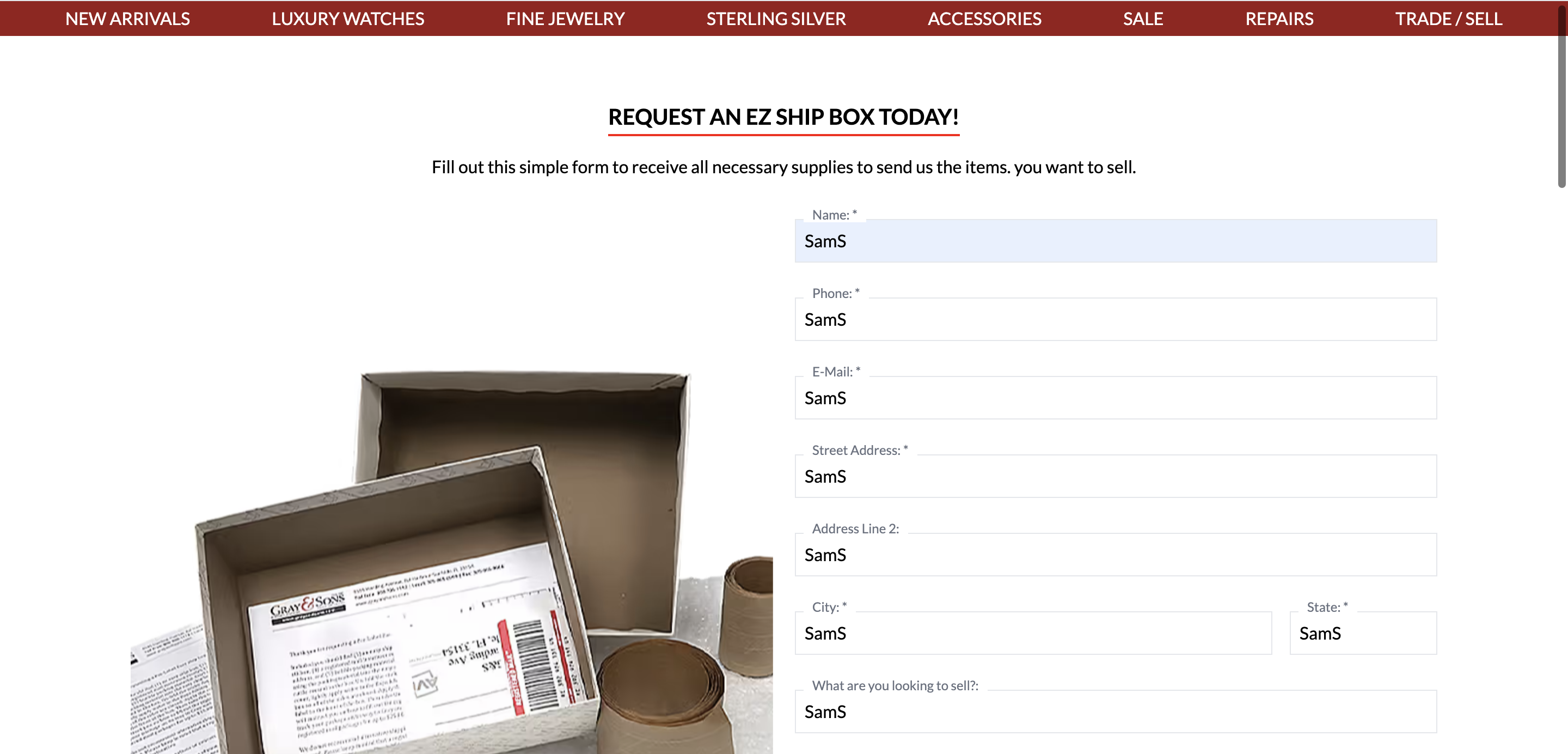
Warnings
- Dennis Address text is not centered
Recommendations
- Greg Add invisible recaptcha to protect form from Spam https://developers.google.com/recaptcha/docs/invisible?hl=en
Greg: Based on our experience on SellUsYourJewlery.com, we don't need to add recaptcha to the contact form. We've never had spam submissions on that form as the submission requires a JavaScript execution (onSubmit handler), so it basically works as an invisible captcha. If something changes, I'll keep this recommendation in the backlog
Page: https://fabulous-gecko-88393f.netlify.app/glossary/
No issues found
Page: https://fabulous-gecko-88393f.netlify.app/grayandsons-fanclub/
Warnings
- Dennis Address text is not centered
Mobile
- Dennis Increase cards padding to 1rem
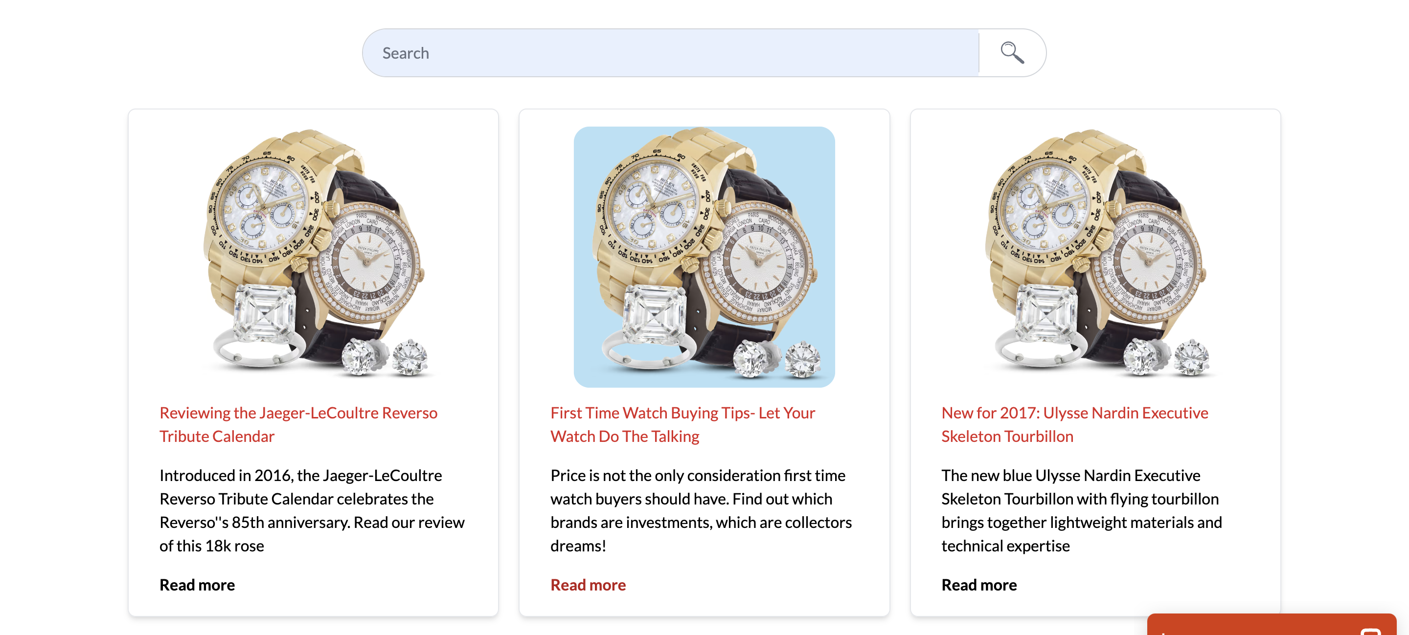
Page: https://fabulous-gecko-88393f.netlify.app/news/
Critical
- Greg Search functionality doesn't work https://www.loom.com/share/ba291a54cc1049599661a5366bedc473
Warnings
-
Dennis Add space after read more button
this button is no longer on the website
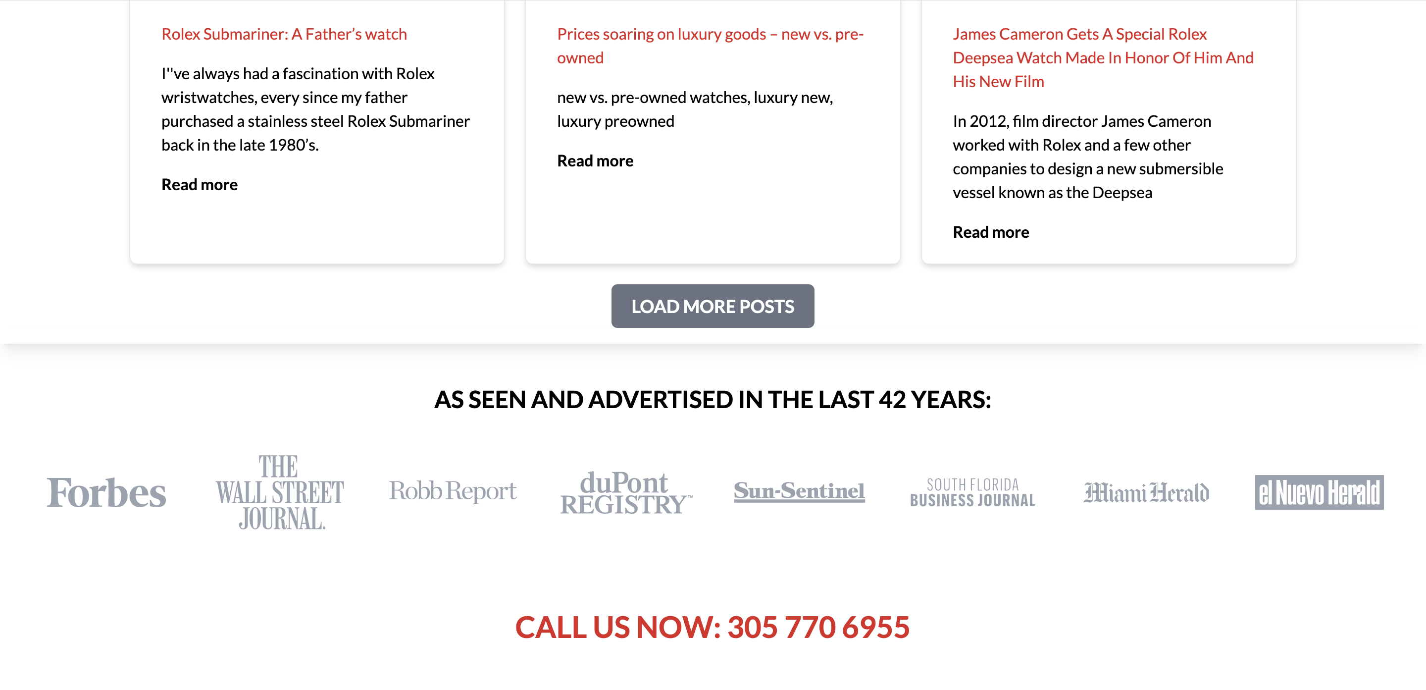
Mobile
- Dennis Add padding for the title "Be the first..."
Recommendations
- Dennis Update cards to make it's link to blog post instead only read more button
Page: https://fabulous-gecko-88393f.netlify.app/pop-up-question-submission-result/
Warnings
- Dennis Address text is not centered
Page: https://fabulous-gecko-88393f.netlify.app/repairs/
Warnings
- Dennis Title cropped weird on some cards, e.g break on 4rd row
https://fabulous-gecko-88393f.netlify.app/shopping-bag/
Page: https://fabulous-gecko-88393f.netlify.app/shopping-bag/
Critical
- Dennis Remove that page, seems like duplicate https://fabulous-gecko-88393f.netlify.app/checkout/
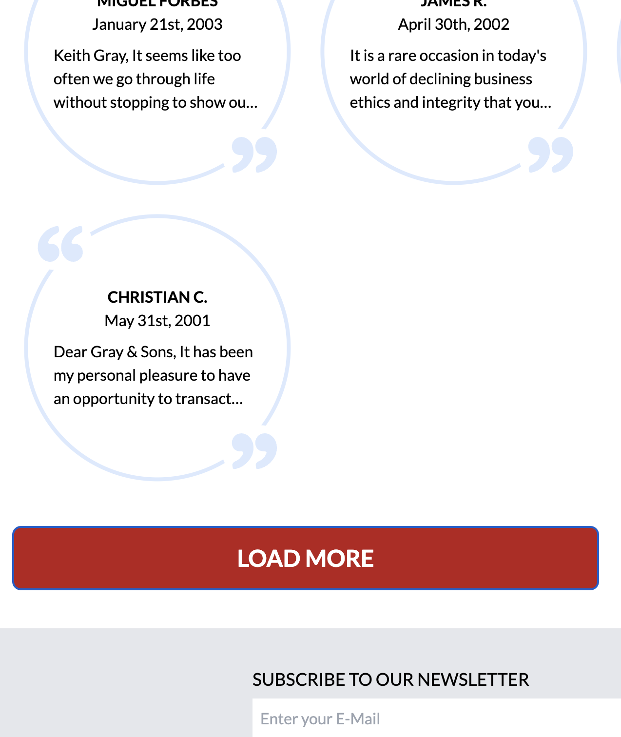
Page: https://fabulous-gecko-88393f.netlify.app/testimonials/
Critical
- Greg Load more buttond doesn't work
Page: https://fabulous-gecko-88393f.netlify.app/thank-you-catalog/
Warnings
- Dennis Address text is not centered
Mobile:
- Dennis Increase cards padding to 1rem
Page: https://fabulous-gecko-88393f.netlify.app/thank-you-contact-form/
Warnings
- Dennis Address text is not centered
Mobile:
- Dennis Increase cards padding to 1rem
Page: https://fabulous-gecko-88393f.netlify.app/thank-you-email-subscribe/
Warnings
- Dennis Address text is not centered
Mobile:
- Dennis Increase cards padding to 1rem
Page: https://fabulous-gecko-88393f.netlify.app/thank-you-shopping/
No issues found
Page: https://fabulous-gecko-88393f.netlify.app/contact-us/
Critical
- Greg Should be removed and all links to contact-us updated to contact?
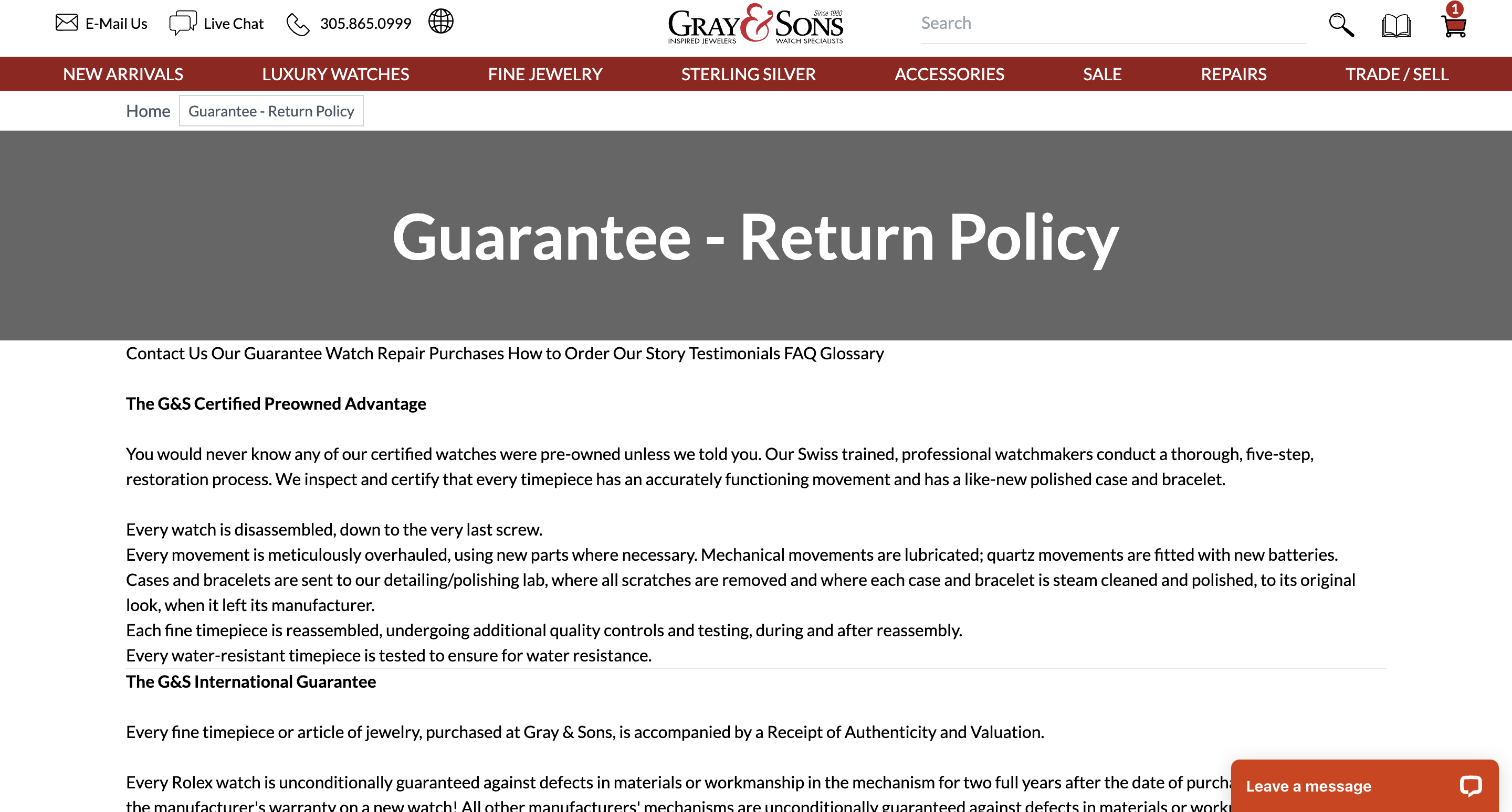
Page: https://fabulous-gecko-88393f.netlify.app/returns/
Warnings
- Dennis Add space before body text
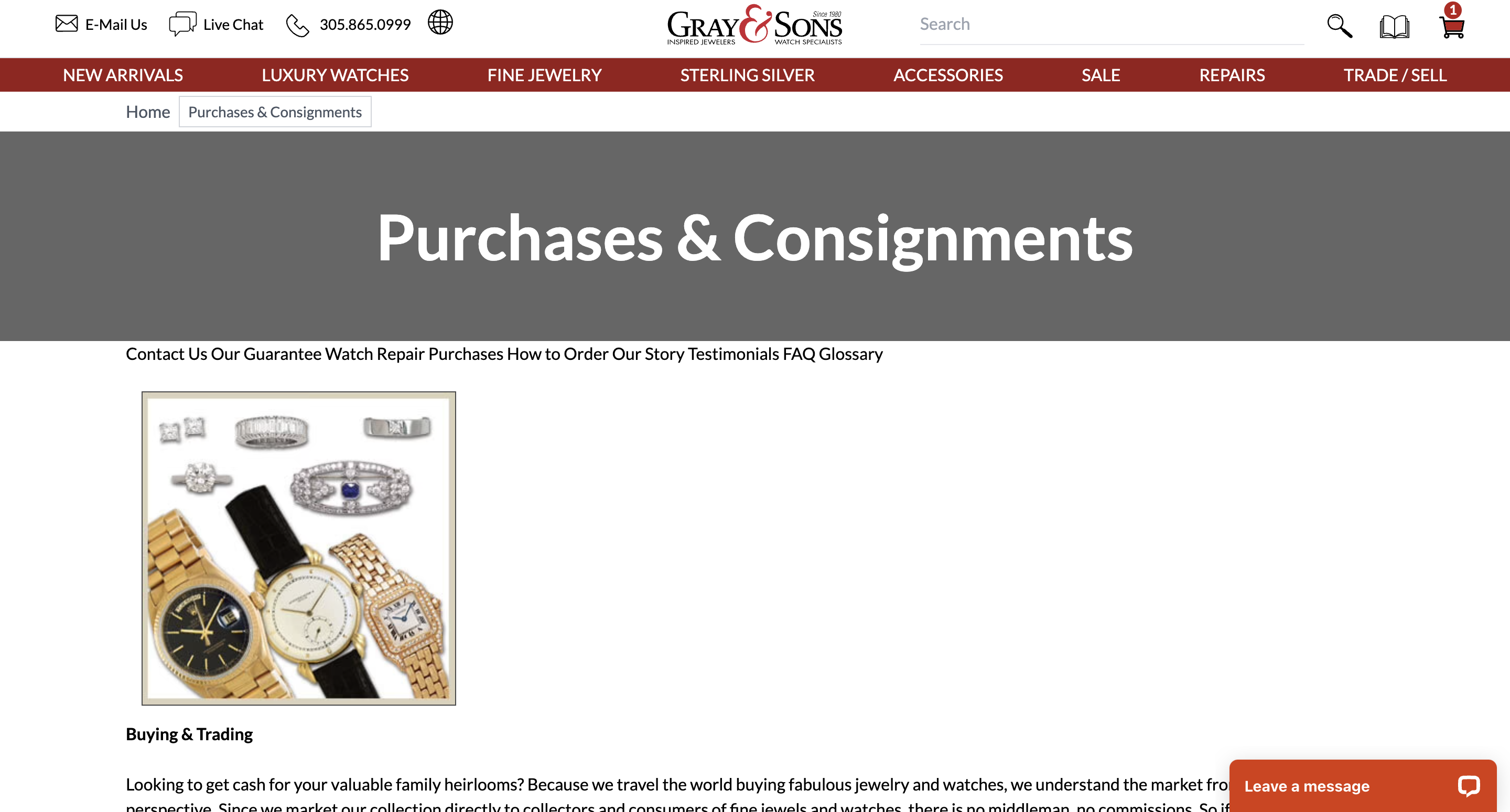
Page: https://fabulous-gecko-88393f.netlify.app/purchases/
Warnings
- Dennis Add space before body text
Page: https://fabulous-gecko-88393f.netlify.app/ourstory/
Warnings
- Dennis Add space before body text
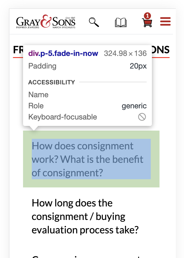
Page: https://fabulous-gecko-88393f.netlify.app/faq/
Critical
- Dennis Reduce white space on mobile between faq and have questions views
Warnings
-
Dennis Add chevron icon for faq header to show user that it's possible to open faq item
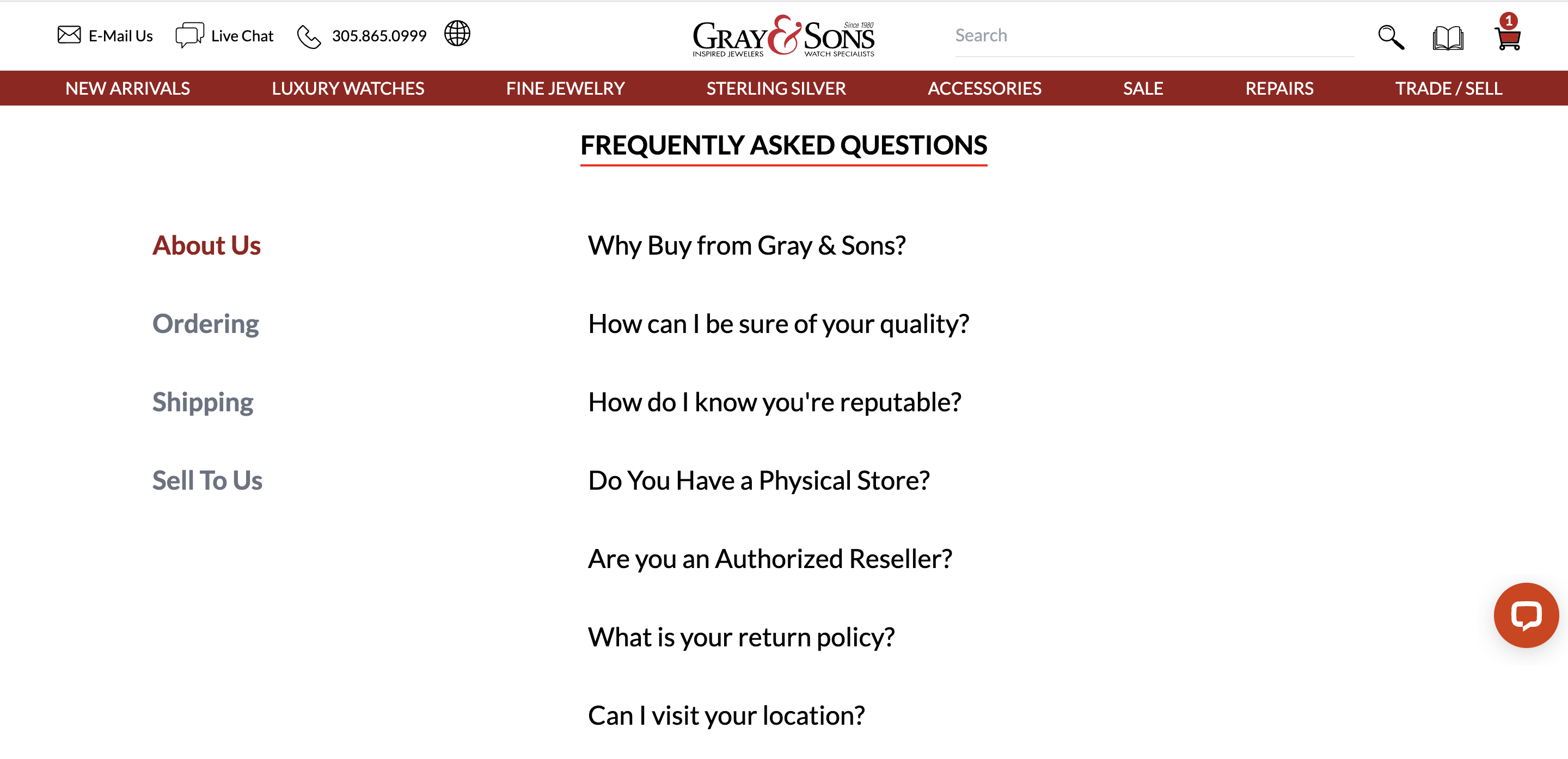
-
Dennis Layout padding is missing
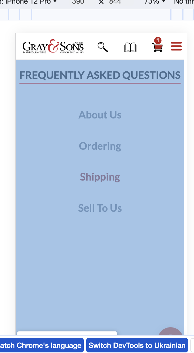
Recommendations
- Dennis Update FAQ view width on mobile to make 100% instead 81%.
Page: https://fabulous-gecko-88393f.netlify.app/easy-ship-box-repairs/
Critical
- Greg Seems like page is not finished or should be removed
Page: https://fabulous-gecko-88393f.netlify.app/special-offer/
Critical
-
Dennis Seems like page is not finished and should be fixed
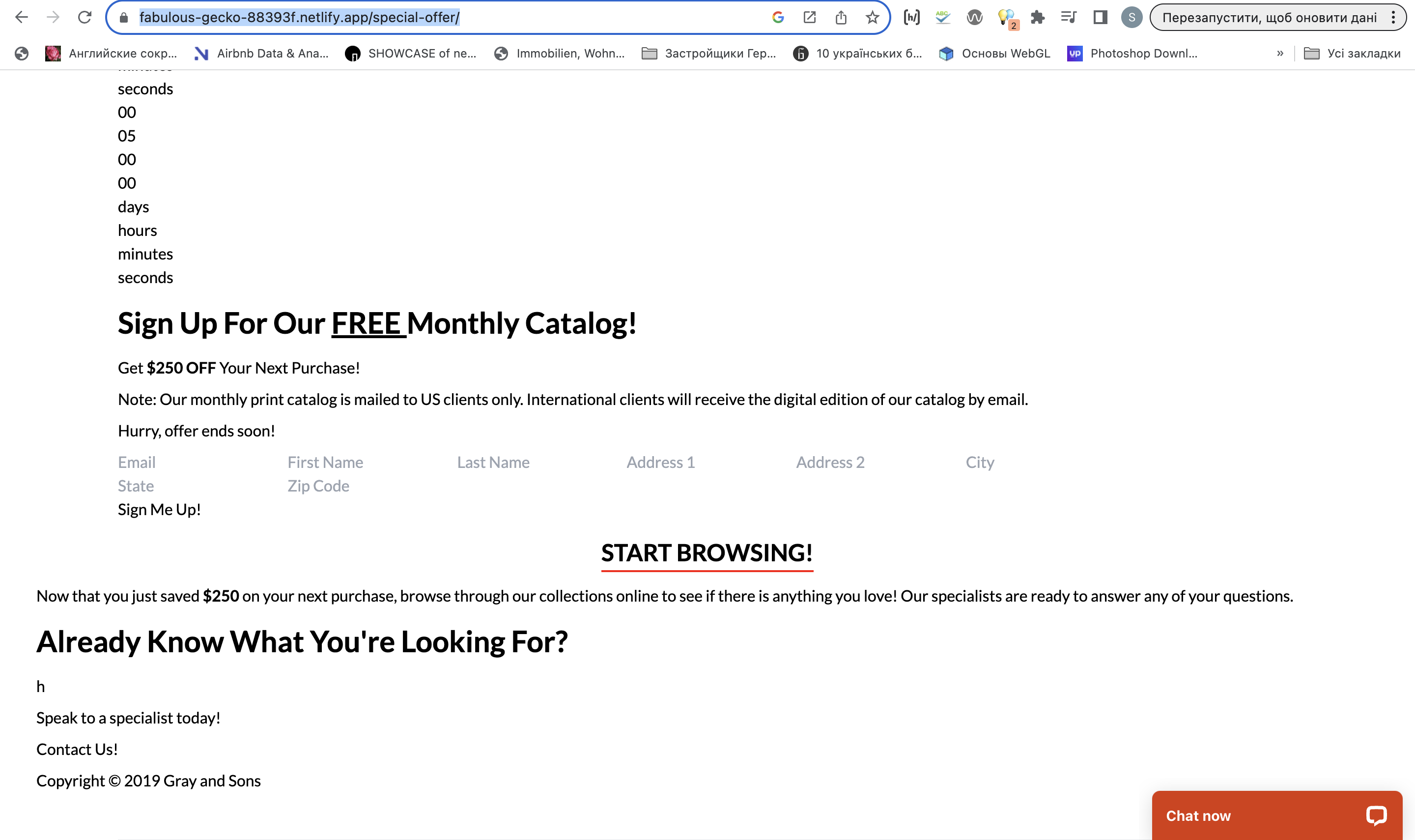
Sam: Dennis, I don't see any updates here, can you check please once again?
Dennis: This page was Removed / Deleted
Pages:
Critical
- Dennis https://fabulous-gecko-88393f.netlify.app/miami-watch-repair/ --- 404 Page
- Dennis https://fabulous-gecko-88393f.netlify.app/miamibeach-watch-repair/ - Done but need to confirm
- Dennis https://fabulous-gecko-88393f.netlify.app/miami-jewelry-repair/ - should be fixed
- Dennis https://fabulous-gecko-88393f.netlify.app/surfside-watch-repair/ - should be fixed
- Dennis https://fabulous-gecko-88393f.netlify.app/jaeger-lecoultre-duometre-chronograph/ - should be fixed
- Dennis https://fabulous-gecko-88393f.netlify.app/westpalmbeach_jewelryrepair/ - should be fixed
- Dennis https://fabulous-gecko-88393f.netlify.app/balharbour-watch-repair/ - should be fixed
- Dennis https://fabulous-gecko-88393f.netlify.app/ulysse-nardin-sonata-watch/ - should be fixed
- Dennis https://fabulous-gecko-88393f.netlify.app/balharbour-watch-repair/ - should be fixed
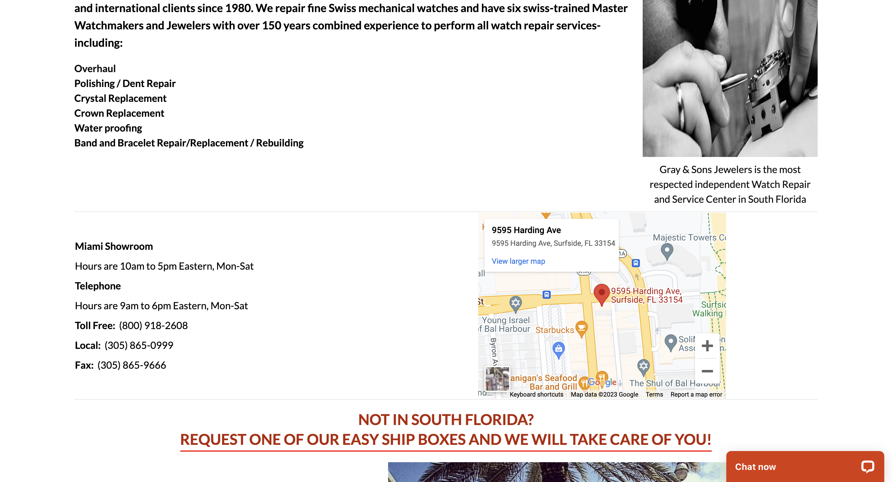
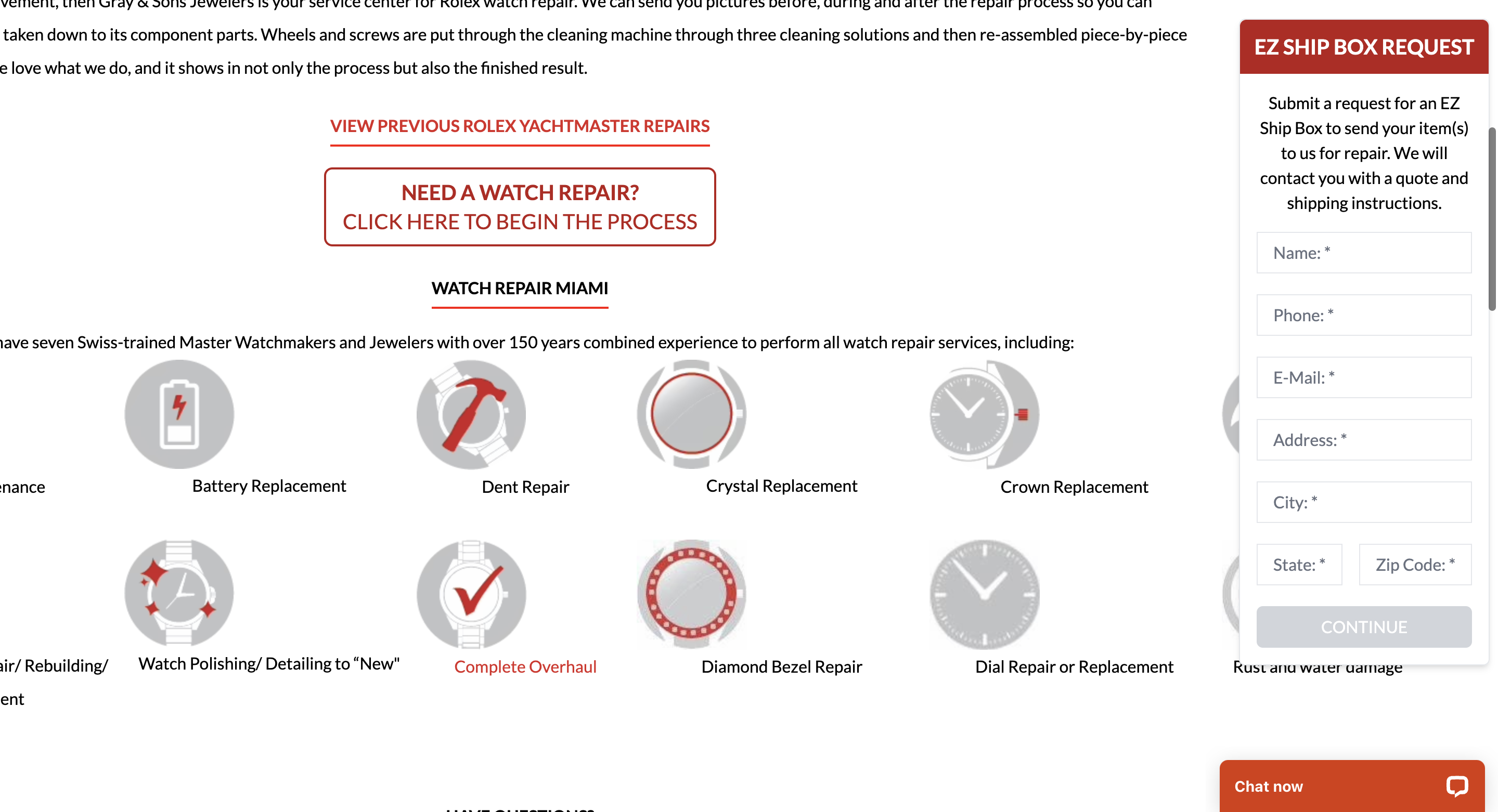
Page: https://fabulous-gecko-88393f.netlify.app/repairs-rolex-yachtmaster/
- Greg Broken layout
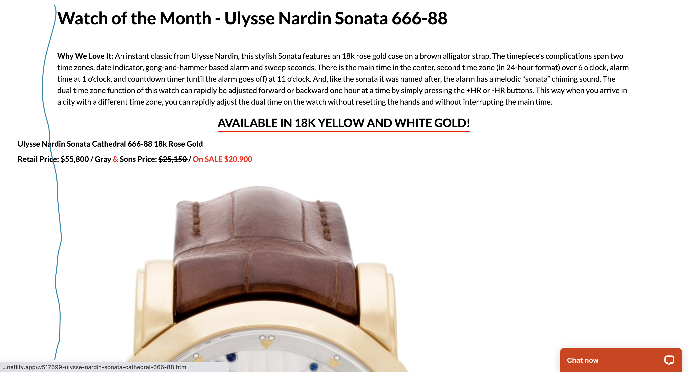
Page: https://fabulous-gecko-88393f.netlify.app/ulysse-nardin-sonata-watch/
-
Should we reduce both images size, to make something like that?
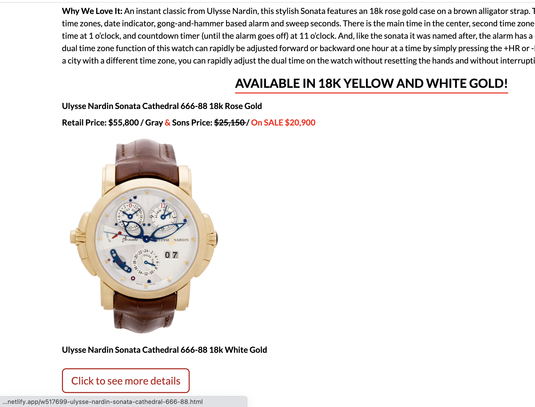
Dennis: These pages are CMS pages. We would have to manually go one by one and reduce images that were originally large. I did reduce images on this page for now.
This is the same page on current site
-
Last one list item has weird inline style
-
Update layout to make the same for all components on the page
Templates
Page: https://fabulous-gecko-88393f.netlify.app/fine-watches/
Critical
- Greg Remove white space on mobile when filter is open

Warnings
-
Dennis Elements look to close to each other, e.g filter, breadcrumbs etc., breadcrumbs should be aligned by left
-
Dennis Add max-width 1366px(the same as header) for layout on large devices > 1680px
Dennis: We do not agree with this recommendation because we want the products to look big on big screens.
Recommendations
- Greg Hide pagination if results number is lower then page limit
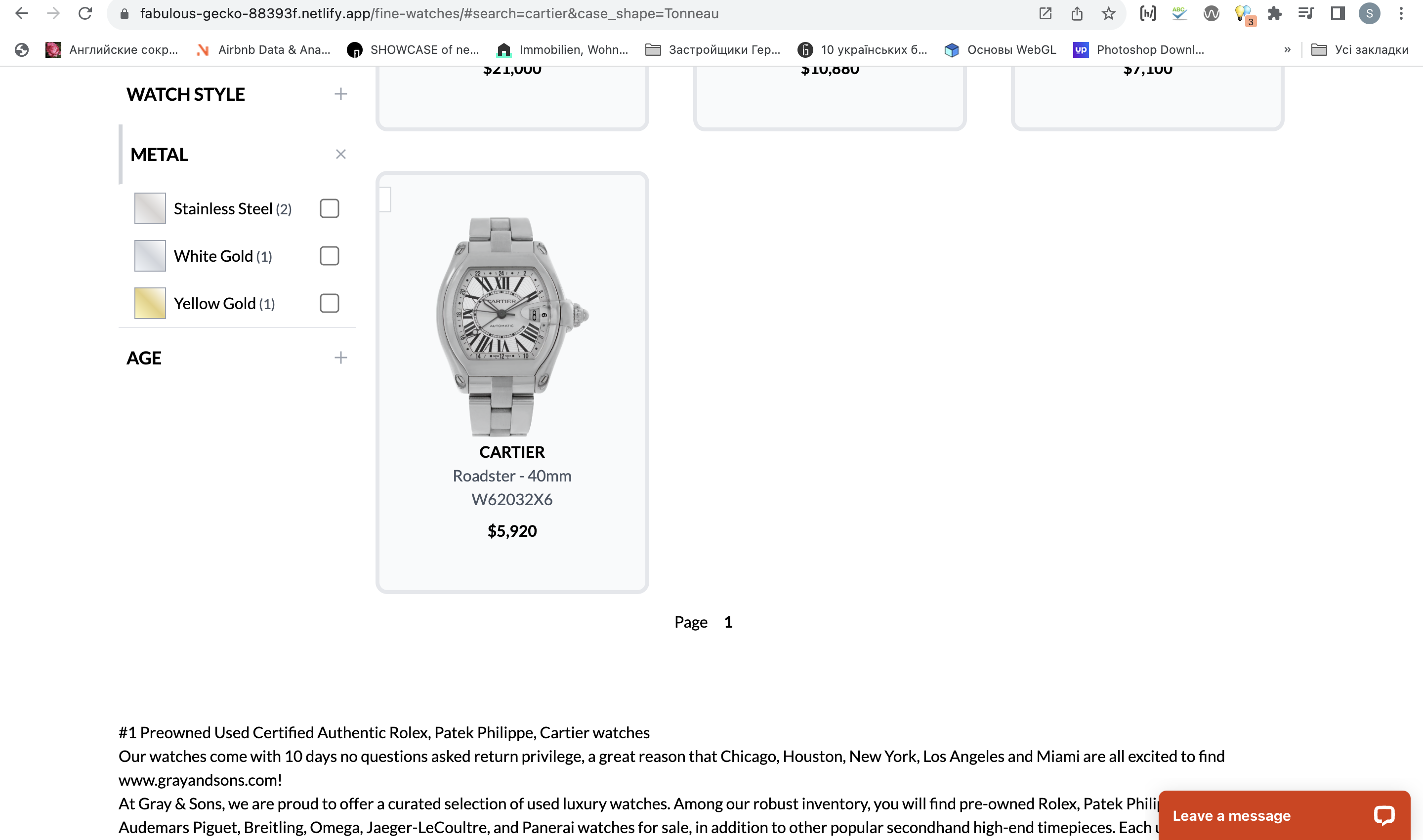 Exmaple: https://fabulous-gecko-88393f.netlify.app/fine-watches/#search=cartier&case_shape=Tonneau
Greg: I believe we want to keep the pagination component to indicate that there are no more results. We've changed the design to make it more clear that this is the last and only page.
- Dennis/Greg Update filter and sort buttons as well as filter and sort menu on mobile to looks more like cartier, e.g full screen width height, prevent scroll, the same way like we have mobile menu
https://www.cartier.com/en-pl/watches/collection-watches/tank
Page: https://fabulous-gecko-88393f.netlify.app/w527584-rolex-daytona-40mm-116509/
Critical
-
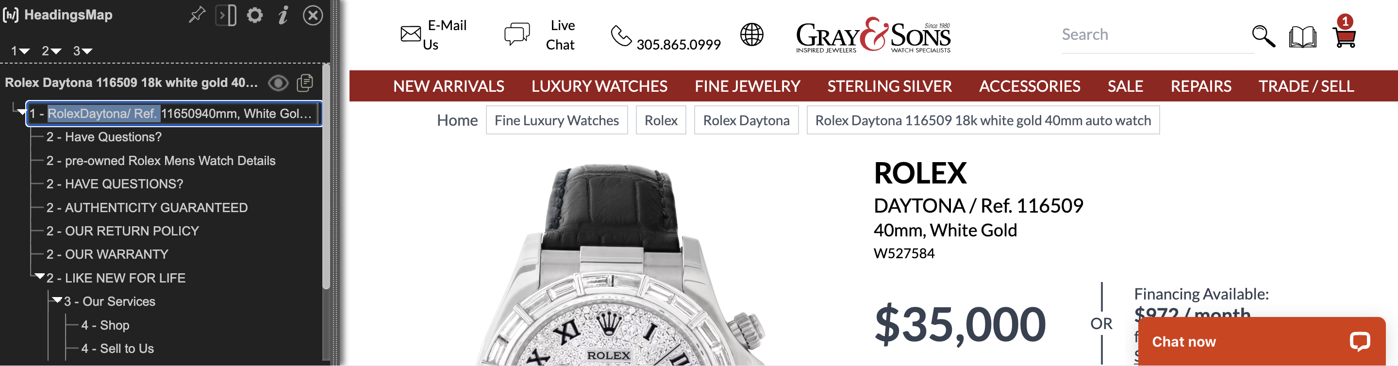
Dennis/Greg Updata h1 to make it correct e.g add space after text: Rolex Daytona/ Ref. 11650940mm, White Gold, Stainless Steel, not RolexDaytona/ Ref. 11650940mm, White Gold
Sam: Dennis, maybe I confused you, please see attached screenshot. Now we have title "RolexDaytona/ Ref ....", that might be bad for SEO and should be updated with "Rolex Daytone/ Ref ...."
Warnings
-
Dennis Add space between breadcrumb navigation and header
-
Dennis Update have questions font-size to 15px(mobile devices) to prevent address break
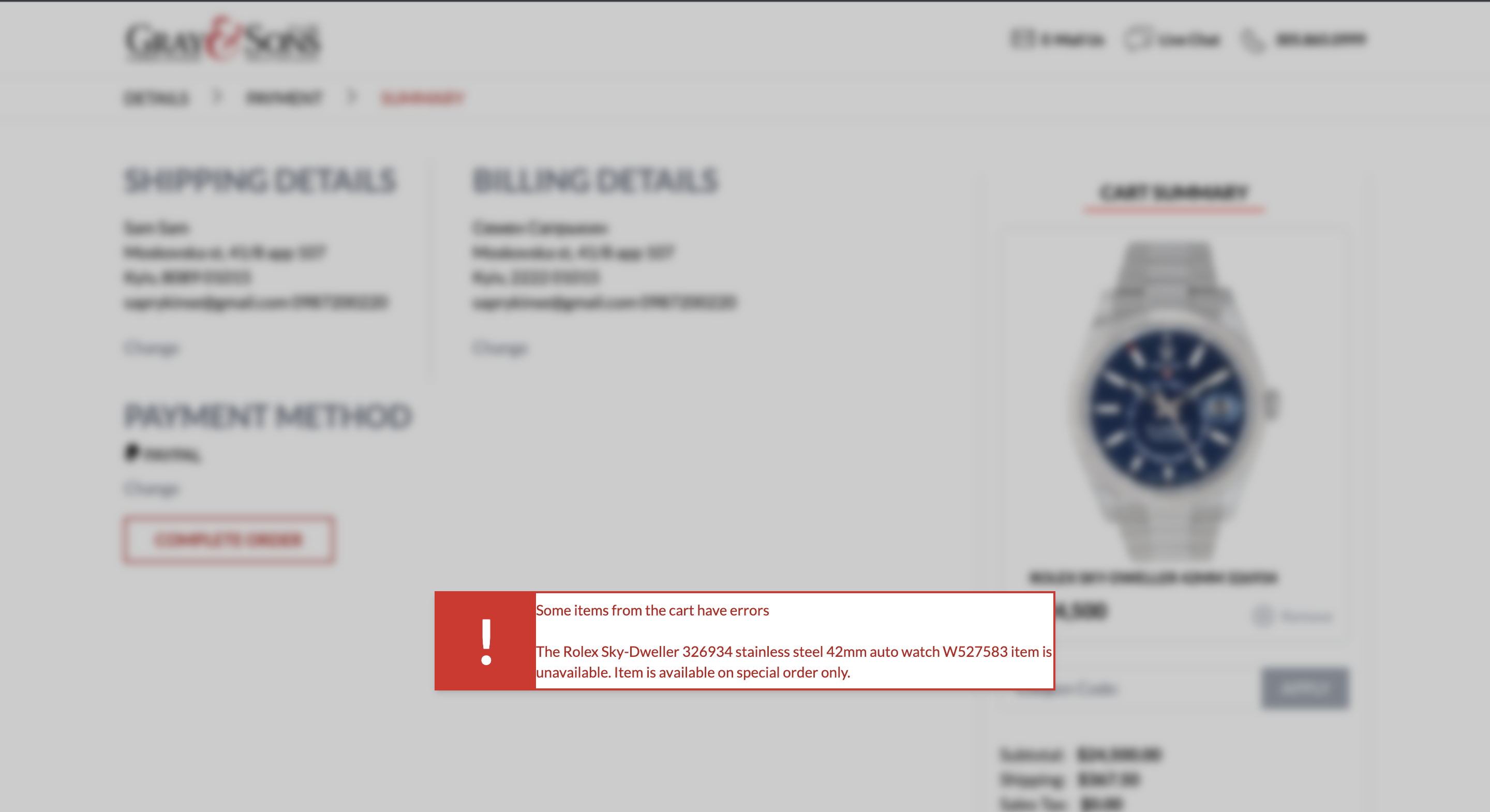
Page: https://fabulous-gecko-88393f.netlify.app/w527583-rolex-sky-dweller-42mm-326934/
Critical
- Dennis Update h1 to make it correct e.g add space after text: 1 Rolex Sky-Dweller/ Ref. 32693442mm, Stainless Steel, not RolexSky-Dweller/ Ref. 32693442mm, Stainless Steel
Warnings
-
Dennis Add space between breadcrumb navigation and header
-
Dennis Update have questions font-size to 15px(mobile devices) to prevent address break
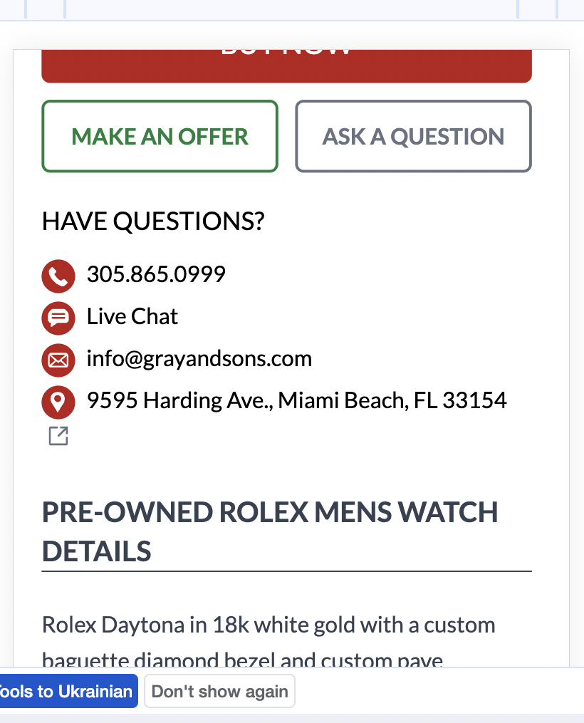
Page: https://fabulous-gecko-88393f.netlify.app/n516707-masterpiece-sterling-silver-flatware/
Critical
- Dennis Update h1 to make it correct e.g add space after text: 1 Rolex Sky-Dweller/ Ref. 32693442mm, Stainless Steel, not RolexSky-Dweller/ Ref. 32693442mm, Stainless Steel
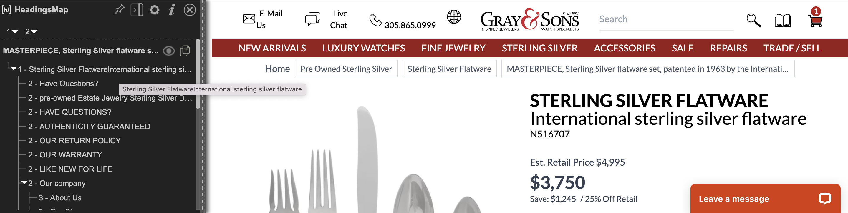
Warnings
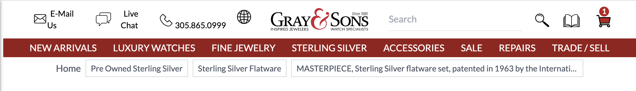
- Dennis Add space between breadcrumb navigation and header
Page: https://fabulous-gecko-88393f.netlify.app/n516707-masterpiece-sterling-silver-flatware/
Warnings
-
Dennis Breacrumbs are not aligned and broke layout on mobile devices
-
Greg Hide pagination when we have only one page in results
Greg: I believe we want to keep the pagination component to indicate that there are no more results. We've changed the design to make it more clear that this is the last and only page.
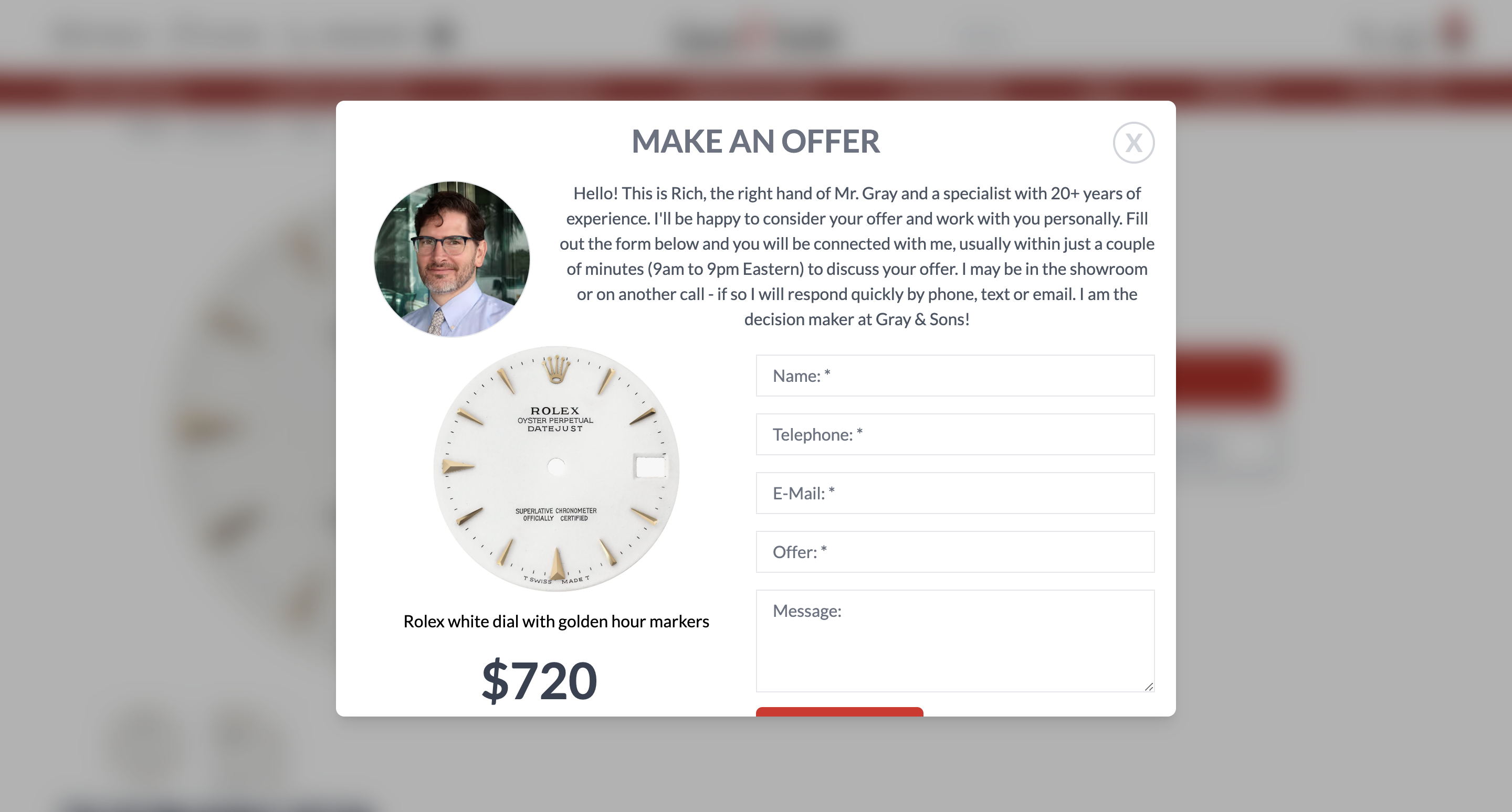
- Dennis Update "MAKE AN OFFER" modal to close by clickoutside like it works for ask question and update size so user can see whole content without scroll
Page: https://fabulous-gecko-88393f.netlify.app/blog/
Critical
Desktop
- Greg Search functionality doesn't work https://www.loom.com/share/1644e08de75b479cb2b388fea11ce701
Warnings
Desktop
- Dennis Add some gap between title and subtitle, desktop and mobile
Mobile
- Dennis Update space between latest products title and product cards to make the same as we have for Have a questions title
Recommendations
- Dennis Update space between load more button and have a question section, right now it looks like button is related to have questions view
 g/
g/
Pages:
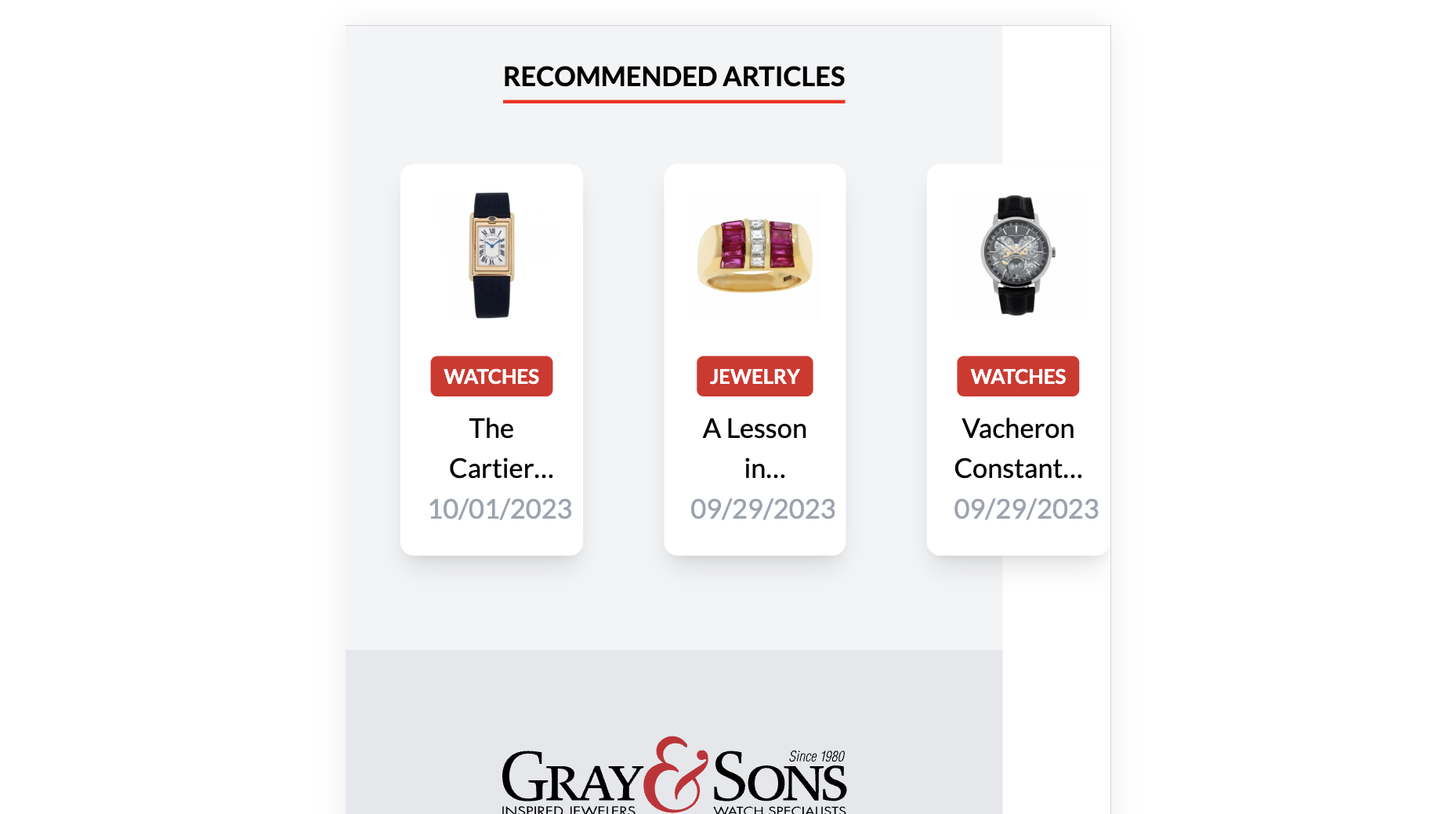
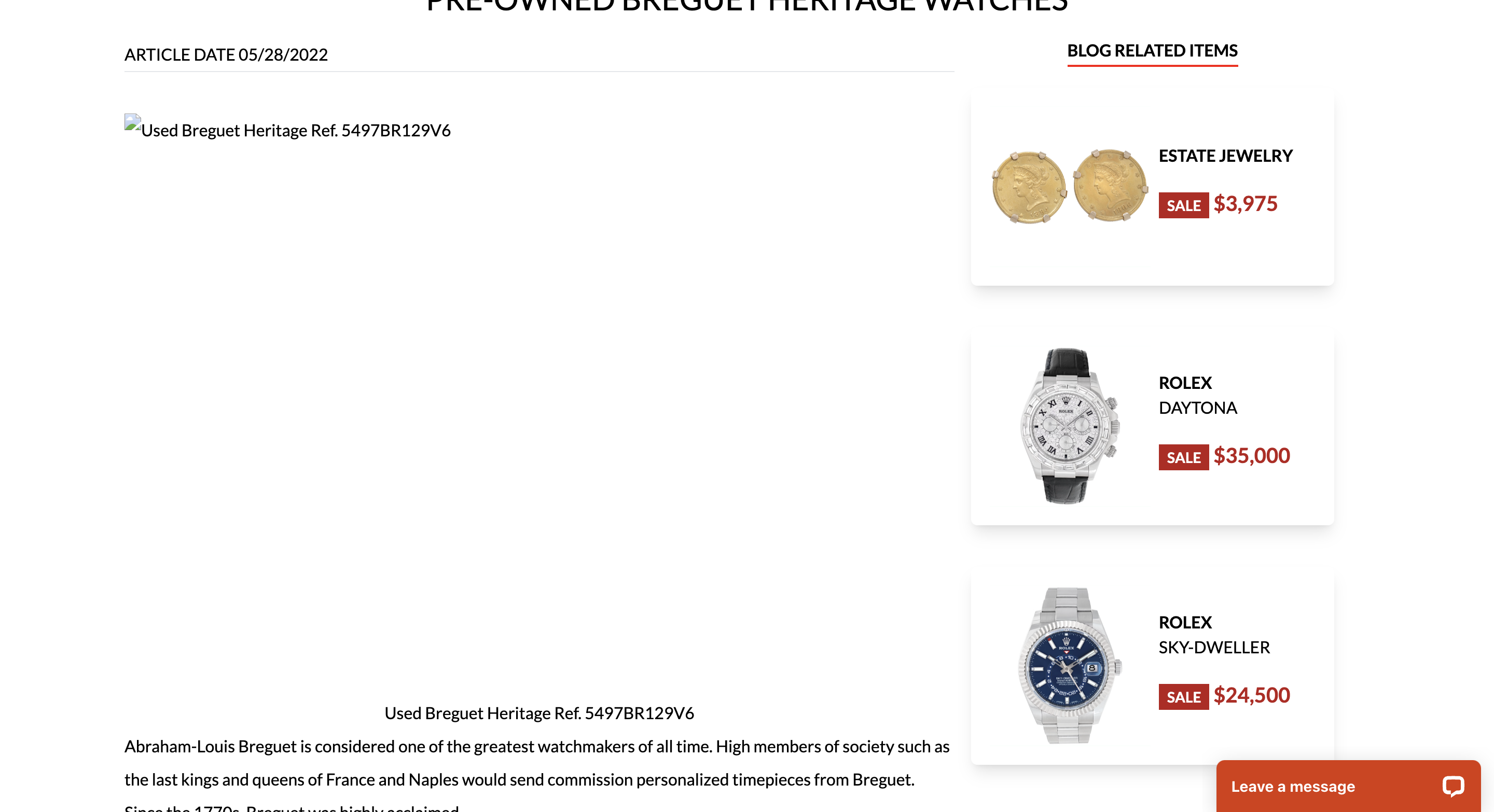
1. https://fabulous-gecko-88393f.netlify.app/blog/pre-owned-breguet-heritage-watches/
2. https://fabulous-gecko-88393f.netlify.app/blog/a-lesson-in-statement-making-style-bulgari-jewelry-trends-for-the-bold-modern-woman/
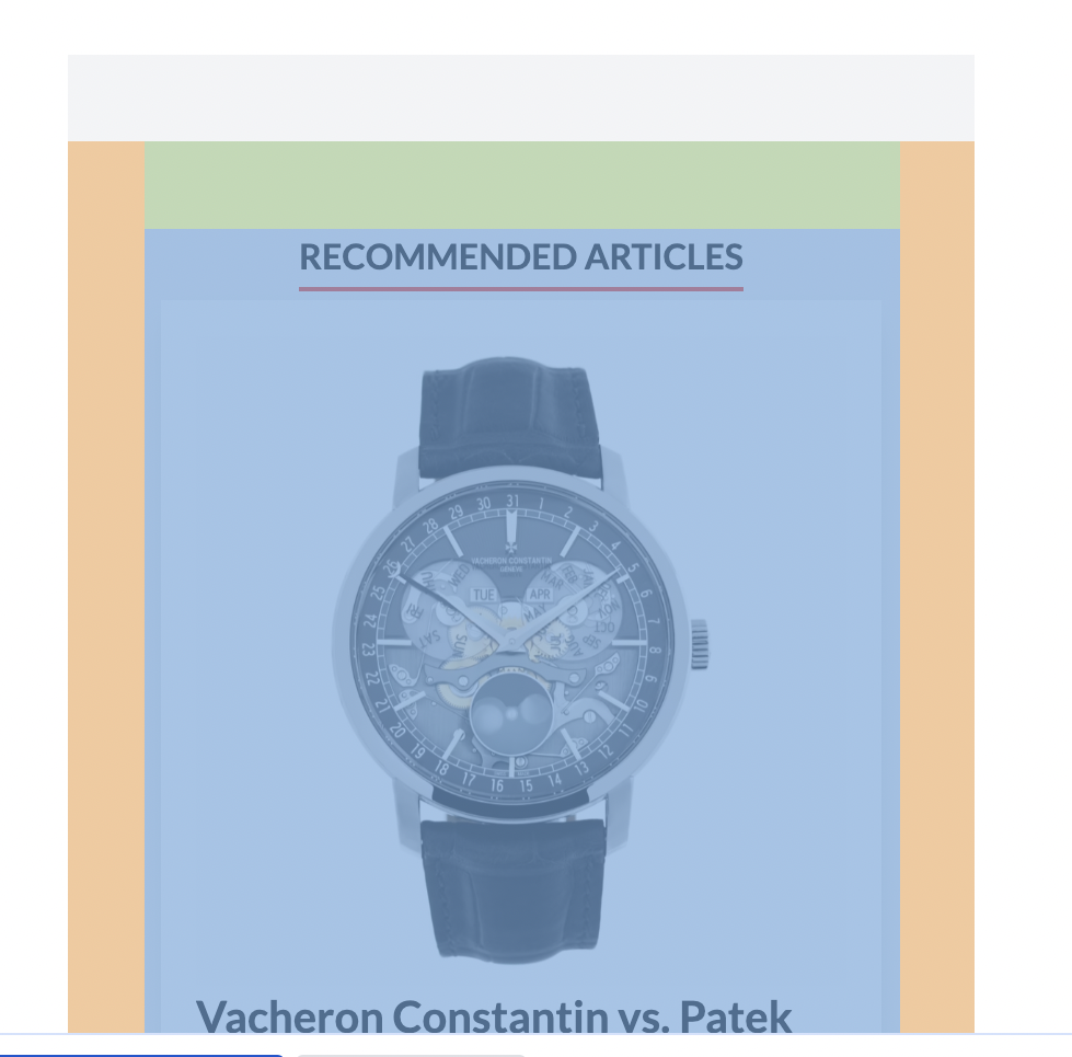
3. https://fabulous-gecko-88393f.netlify.app/blog/vacheron-constantin-vs-patek-philippea-battle-of-horological-titans/
Critical
Mobile
-
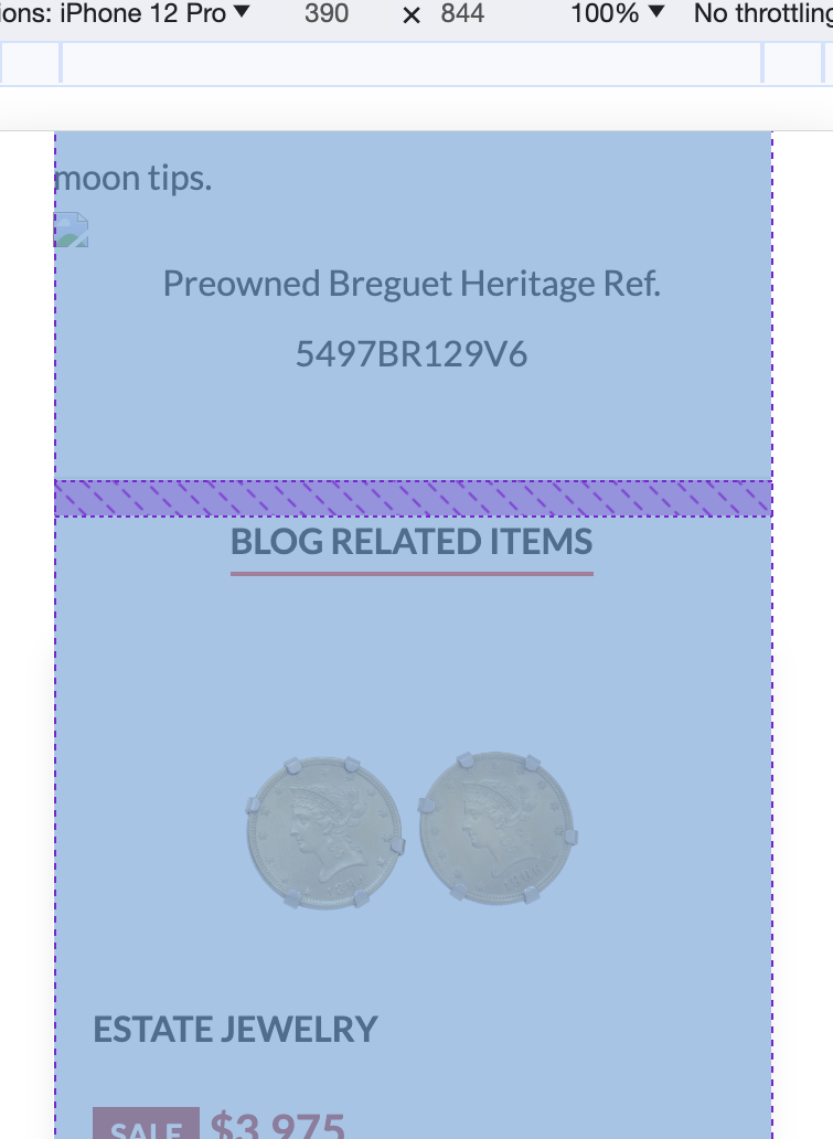
Dennis Recommended articles section brokes layout and gap between cards looks too large
-
Greg Some articles have broken images https://fabulous-gecko-88393f.netlify.app/blog/pre-owned-breguet-heritage-watches/, https://fabulous-gecko-88393f.netlify.app/blog/pre-owned-breguet-heritage-watches/
-
Add space between title(recommended articles) and cards on mobile
Warning
-
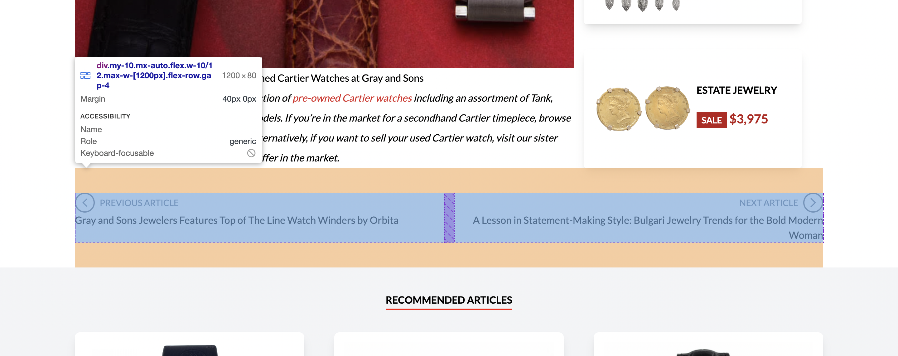
Dennis 1. Previous next buttons layout is larger then other
Warnings
- Dennis Update layout to make it like on other pages, e.g width: 100% and padding left right: 20px instead 81.1% - blog body, next previous articles
Page https://fabulous-gecko-88393f.netlify.app/find-your-watch
Critical
-
Dennis Add gap before footer
-
Dennis Add gap to show more button
-
Dennis Mobile Ui doesn't look good, please update slider to make if full width and make it sticky, so user can see results immediataly and don't have to scroll to top.
Dennis: Can't figure out how to make sticky work in mobile.
Sam: sure Dennis, please add these styles(you can see it on screenshot) on mobile devices for slider layout, please ping me if that won't work, I'll create PR.
Dennis: THANK YOU! lol
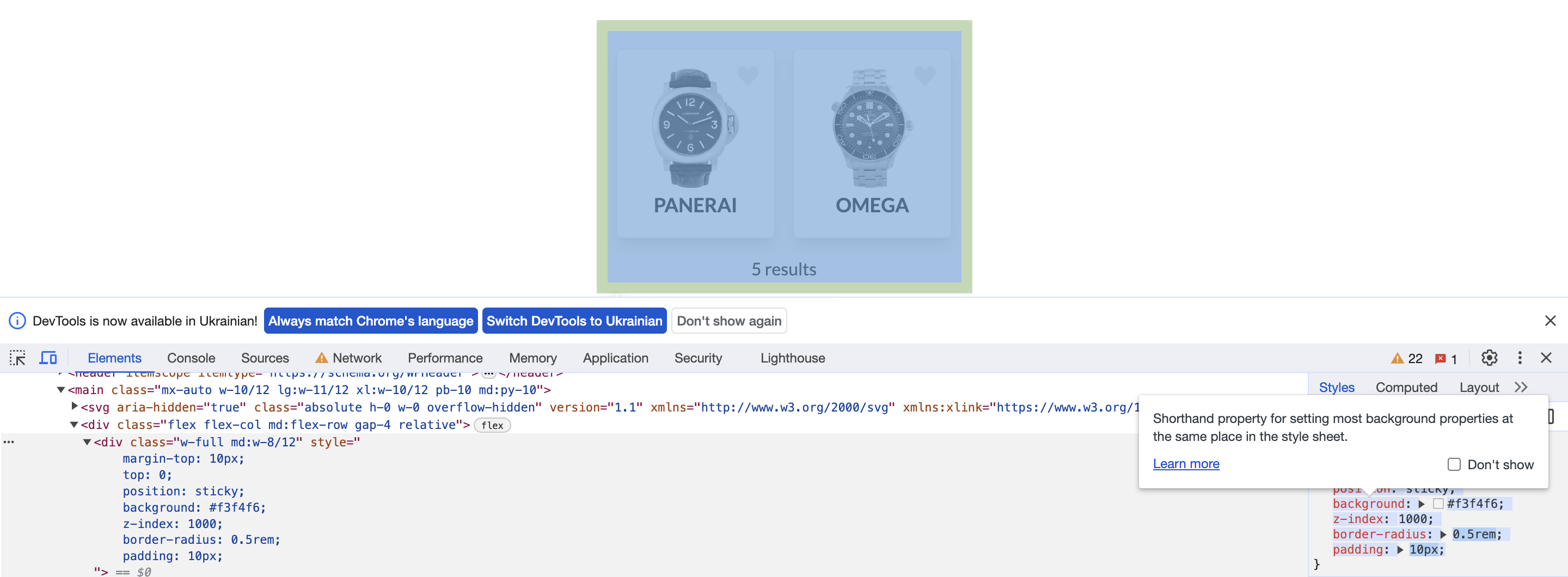
margin-top: 10px; top: 0; position: sticky; background: #f3f4f6; z-index: 1000; border-radius: 0.5rem; padding: 10px;
Please take a look example:
https://www.loom.com/share/46555528427d40fe854790883bd26879?sid=208e0019-48f7-412d-8e9e-337e29496dee